Electronic health records are complex, and attempting to visually display the nonlinear work of patient care is challenging. This chapter from Mastering Informatics: A Healthcare Handbook for Success examines evidence-based core concepts that can provide a foundation for system design informaticists.

Healthcare leaders are increasingly expressing dissatisfaction with their clinical information systems, and often cite cost and difficulty of use as contributing factors (Gregg, 2014). Face it: Electronic health records (EHRs) and order-entry systems are complex and typically lack intuitiveness, and navigation does not always support a smooth workflow. The Healthcare Information and Management Systems Society (HIMSS) Electronic Health Record Usability Task Force report cited that usability was perhaps the most important factor that hindered the widespread adoption of EHRs prior to the signing of the Health Information Technology for Economic and Clinical Health (HITECH) Act in 2009 (Belden, Grayson, & Barnes, 2009). Since then, organizations have worked quickly to get these clinical systems in place to take advantage of the incentive dollars offered through the Centers for Medicare and Medicaid Services (CMS) Meaningful Use incentive program (ONC, 2013). Adoption has been swift since 2009, yet enhancements to usability have been slow.
The challenges that we face regarding usability in healthcare IT are several. First, there is no standard and accepted definition of usability in the healthcare IT industry. Several are offered that are very good, but none seem to be the gold standard from which we all work. Nielson (1995) defined usability as “a quality attribute that assesses how easy the user interfaces are to use.” Further, Zhang and Walji (2011) noted that usability “…refers to how useful, usable, and satisfying a system is for the intended users to accomplish goals by performing certain sequences of tasks” (p. 1056).
Second, we have the issue of individual perspectives and paradigms. What may make perfect sense on a display screen to one person may not be as clear to another. Reasons for this are several and may be due to the person’s level of exposure to technology, their age and education, and perhaps gender.
The bottom line is that healthcare is complex, EHRs are complex, and attempting to visually display the nonlinear work of caring for patients is a huge challenge. However, several core concepts that are evidence-based can help lay a strong foundation for those informaticists working in the area of system design. This chapter will focus on those core concepts and give readers the tools to evaluate and improve their systems.
Assessing usability
The current state of usability leaves us with much work to do in a complex and fast-paced, ever-changing environment. Middleton et al. (2013, p. 3), in a position paper on behalf of the American Medical Informatics Association (AMIA), stated, “[T]he ability to perform meaningful, reproducible, objective usability metrics for EHR systems is limited by the socio-technical nature of the systems. They are typically highly configurable and different providers will implement them in different ways, with markedly different process.”
So, what is the big deal with usability? What are the origins? What are the side effects of poor usability? Why is it important to you and your users?
First, a historical perspective. Studies of usability have a long and distinguished history. In the early twentieth century, during the Industrial Age, pioneer studies were conducted on human interaction with machines to increase productivity and improve worker safety. Usability and human interactions took on a new level of importance in the World War II era, specifically in aviation. During this time, human interaction with the electronic control panel was more complex than ever before.
Quite obviously, technology grew more sophisticated over the decades as did the science of usability. In the 1960s and 1970s, the first homegrown electronic records were introduced, including one of the largest at Veterans Administration (VA) Medical Centers (Atherton, 2011). In the 1970s, Xerox was one of the first technology companies to incorporate the user experience in design of their systems, hardware, and software. In the 1980s, when the PC became a commonplace device, the industry took the concepts from earlier decades and spun off a number of user interfaces.
This is also when the electronic gaming industry began to take off. The entertainment factor—and therefore usability—has been essential to success in this sector. Some of these same gaming concepts are present today in more recent EHR development. Notably, in the 1980s, Apple launched the Macintosh user interface. Needless to say, its success has been evident in the usability arena (Spillers, 2007).
In the 1990s and early 2000s, usability was recognized as a strategic element to success in system implementation. Tools exist through the Usability Professionals’ Association (UPA) to measure usability concepts from acceptance to return on investment (UPA, 2012).
What happens when a system is designed with poor usability? Koppel et al. (2005) published a bold study noting that poorly designed computerized physician order entry (CPOE) systems were the cause of 22 types of medication errors risks. The methods used in the study included direct observation, expert interviews, staff interviews, focus groups, and surveys to garner the most complete information. Of the identified medication error risks, a few of the types included medication discontinuation failure, wrong medication selection, and conflicting or duplicative medication selections. Also noted in this study, “…fifty-five percent of house staff reported difficulty identifying the patient they were ordering for because of fragmented CPOE displays; 23% reported that this happened a few times weekly or more frequently” (p. 1200). While noting the importance of how clinicians’ work is organized, independent of the technology, the most significant findings were related to the human interaction with the technology: the usability of the system. The study conclusion was that the use of the CPOE system as it was evaluated actually facilitated medication errors rather than reducing them.
Wow! Let that sink in for a minute. We just answered the question about why usability is important to you and your users. Poor usability has the distinct potential to lead to errors, which is the very thing we try to prevent. If we get down to brass tacks, we know that errors are costly from the patient’s standpoint and organizationally. It makes sense and “cents” that we give usability due attention.
Applying usability evidence
Comprehensive tools for usability evaluation can be found through a number of sources, both internally and externally to the healthcare IT industry. One helpful site that contains numerous links to practical resources on user experience with technology, evaluation tools, and concepts of visual design is an interactive website managed by the Digital Communications Division in the U.S. Department of Health and Human Services (2014) Office of the Assistant Secretary for Public Affairs. This website contains links to valuable information on the “what and why” of usability in addition to access to a wide variety of tools and methods to assess the design and usability in clinical systems (
http://www.usability.gov).
Two additional resources stand out as being very usable themselves, and are based on evidence with the guidance of industry experts. In the sections that follow, fundamental and practical examples of usability in a healthcare environment are presented, using these tools as the foundation from which informatics specialists can begin to evaluate and improve the systems they are responsible for designing.
One of these tools is the document, “Defining and Testing EMR Usability: Principles and Proposed Methods of EMR Usability Evaluation and Rating,” published by the HIMSS Usability Task Force (Belden et al., 2009). Its usability rating tool includes a five-star rating system and defines the necessity of formative and summative evaluation, the first of which is the responsibility of the vendor and the latter, the responsibility of the customer. These concepts are further defined in an article by Boone (2010), “EMR Usability: Bridging the Gap between Nurse and Computer.” These resources identify nine areas where informatics specialists should focus attention not only during the initial design phase of system implementation but at any time during the system’s lifecycle. These nine areas of focus are:
- Simplicity
- Naturalness
- Consistency
- Minimizing cognitive load
- Efficient interactions
- Forgiveness and feedback
- Effective use of language
- information presentation
- Preservation of context
Simplicity
The essential message here is the simpler, the better. “Simplicity is concise information displayed to the user, including only the functionality and data needed to effectively accomplish tasks and decision making” (Boone, 2010, p. 15).
Designing screens that are clean, clear, and as intuitive as possible is the goal of simplicity. The concept is exemplified by building stackable content within the EHR, giving users only what they need to make the best decisions for the patient and move smoothly to the next step. By stackable, we mean segments of content that can be added together, or “stacked,” to best paint the care picture for your patient.
Take order sets as one example of stackable content. As healthcare providers, we want to ensure that the latest evidence-based content is reflected in ordering processes and the needs of the patient are addressed. While attempting to accomplish just that, many users find order sets to be cumbersome and time consuming. Order sets are often built as a “laundry list” of every possible order that a patient could need, from admission to discharge for a given diagnosis. The sets might be broken into categories of like orders, diagnostics, imaging, and medications with only a few defaults selected; or perhaps the selections are left entirely to the user to discern. Although the intent of an order set is to ensure that the provider has the needed content and does not miss a critical step, the end result is lots of scrolling and frustration, which could lead to the exact opposite of the intent.
So, how to solve this conundrum? How do we motivate providers to use evidence-based order sets? The takeaway: Do not overthink it. Keep it simple. Make it as easy as possible for the end user to do the right thing, enter what they need to enter for the patient, and move on. Providers need to get to the business of tending to the patient, not tending to the system.
Walk through this scenario. Your patient comes through the Emergency Department and has a diagnosis of sepsis. We know that a sequence of events, if implemented in a timely fashion, increases the chance of survival (Society of Critical Care Medicine, 2012). Rather than complicate the process with extraneous orders, imagine using a quick order set with just the necessary elements needed for this immediate care. We would want most of those necessary elements already entered (default presets) to save time and ensure consistency.
Before we move on, think about a few stumbling blocks on the road to simplicity. Here’s an example. What about all of the possible antibiotics that could be used in the initial treatment? Here is an opportunity to use the 80/20 rule, which states that when looking at a page within the application, the user should be able ascertain the needed information 80% of the time, and the user will need to dig a little deeper 20% of the time. Look at the evidence-based guidelines for the diagnosis and the data for your facility. Are there recommended antibiotics? Which antibiotics do you use most frequently in your facility? Which are most cost effective? So, perhaps in your quick order set, you have a maximum of three choices, with one of those choices defaulted for the provider. Any outlying factors, such as a patient allergy to the three choices, could be covered by a single standalone order.
Back to our scenario. We know there will be a need for admission and ongoing care of this septic patient. Imagine a stack of building blocks that snap together like the tiny plastic bricks kids play with, as shown in Figure 3.1.
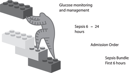 FIGURE 3.1
 Stackable content concept.
Our first building block is the bundle of elements for immediate care (sepsis). Our next block is the order for admission, including elements such as the diagnosis and reason for admission, type of bed, and service. The next block might include things critical for the first 24 hours of care, such as continued antibiotics and any other pertinent medications, labs, diet, and nursing orders for frequency of monitoring.
We also know that rarely do patients present with a single problem to be addressed during a hospitalization. Still using the idea of simple, stackable content, imagine that our septic patient is also diabetic. Make it easy for the provider to pull in the block of orders appropriate for glucose management to stack with the sepsis orders. This block might include orders pertaining to glucose-monitoring frequency, appropriate glucose range, and any medications needed for glucose control.
Overall, we would expect the end result to be easy to use, guiding intuitively from one step to the next, capturing the pertinent data needed for care. In their simplest form, the blocks stack together, connecting the care logically for the patient and the EHR user.
Here are some questions to ask when implementing simplicity:
- Is the system easy to navigate from one step to the next? Take into account workflow process here.
- Does the system present information in a way that is simple, easy to read, and easy to understand?
Naturalness
Boone (2010, p. 15) noted, “[N]aturalness means the end user should be immediately comfortable and familiar with the system.” What does “immediately comfortable” really mean to the user? How do we remove the subjectivity of individual user perceptions? Well, step outside the healthcare setting for a moment to something more universal. How many times have you heard someone say, “Google it!”? When that phrase is mentioned, there is an immediate familiarity with the concept and the look and feel of “Google-ing.” You likely conjured up an image of the rainbow-colored word GOOGLE above a search bar. You have come to expect completion matching on what you are typing in that search bar, and the results page is easy to navigate. You know what to do and what to expect at each step in your search process.
Take that same idea and apply it to the EHR. The user should never have to guess about the next step. She should never be too timid to click a button for fear of where it will take her and worry that she cannot get back to where she started. When searching for a definition of intuitive, Google offers, “a) using or based on what one feels to be true even without conscious reasoning; instinctive; b) (chiefly of computer software) easy to use and understand” (2014). That is exactly the point of “immediately comfortable and familiar.”
Here are some questions to ask to facilitate naturalness:
- Does each screen in your EHR indicate how to get back to the previous screen?
- Is it clear what the next step is when proceeding through the ordering process?
Consistency
With any software application—but particularly in healthcare when safety is at stake—consistency is crucial. Nielsen noted, “[U]sers should not have to wonder whether different words, situations, or actions mean the same thing” (1995, para. 4). Think of some of the most popular software programs in use today. The graphical user interface (GUI)— what the user sees and interacts with on the electronic page—provides consistency. The user may navigate deep into the application, but the consistency with which information is presented, how icons appear, the behavior of the icons, and the overall layout of the screen provides a sense of ease from one task to the next. “The application’s structure, interactions, and behaviors match a user’s experience with other software applications and are consistently applied throughout the EMR” (Boone, 2010, p. 15).
We know that electronic health records (EHRs) are data-rich, including discrete data, subjective data, report data, and so on. We have data that, after being filed, can be seen in multiple locations within the chart. Often those data can be pulled or auto-populated into reports and notes. The question of consistency is not a question. In order to expect consistent results in human behavior and potentially prevent errors, users should expect consistent software behavior.
A few practical examples of consistency included the following:
- A toolbar across the top of the page that never changes, regardless of location in the chart
- An icon that looks like a house to symbolize returning to the Home screen from anywhere in the application
- An expectation that clicking the Next button, for example, will open a similar user workspace
- Despite differing information in reports, a consistent appearance to reports
- Consistent naming conventions and use of a style guide to provide searchable results for builders and users alike (for example, care plans for behavioral health may contain “Behavioral Health” in the title)
Here are some questions to ask regarding consistency:
- Do all your order entry screens and all your clinical documentation screens have a Submit or Save button in the same location?
- Is there a consistent button for the user to return to the Home screen? Is that button in the same location on each screen?
Minimizing cognitive load
Make sure that users are not overwhelmed by what they see and how they interact with the system. “Minimizing cognitive load ensures density, poor end-user feedback, and inadequate data entry field cues don’t lead to sensory overload” (Boone, 2010, p. 15). Too much at one time or in one place takes away from the intention of providing needed information.
Take a minute to explore density a little further, because this concept can sometimes be confusing. One of the simplest definitions of density comes from the world of instructional design. First, for those unfamiliar with instructional design, it is “the entire process of analysis of learning needs and goals and the development of a delivery system to meet those needs” (University of Michigan, 1996, para. 1). In the world of instructional design, density is important to the successful result of a learning experience. Likewise, it translates to the world of electronic records. Density can enhance or detract from the EHR user experience. Gibbons and Fairweather (1998, p. 359) defined density as “the amount of new information knotted up at one new information location.”
An example of poor density may come in the form of a patient information report within the EHR. In this example, we are referring to a report housed within the EHR, not a printed report. How many times have you heard a user say, “Give me a one-stop shop” with all the pertinent information? This request is often fraught with competing priorities. On the one hand, giving users the information they need with minimal clicks or system movement is a plus. However, the density with which the information is presented can be tricky. Too much text, expecting the user to determine new versus old information, or the text size may lend itself to poor density. Beldon et al. (2009) offered the 80/20 rule in this circumstance as well.
A few strategies for minimizing the cognitive load of this report and achieving a balanced density might include the following:
- Ensure that the text size is easy to read.
- Flag new information with a symbol.
- Allow hovering or hyperlinks to gain more details, if desired.
- Use simple, natural, and consistent concepts in the screen layout.
Here are some questions to ask regarding minimizing cognitive load:
- How old is the information that’s displayed? For example, when placing orders for potassium, does the user need to remember the last potassium lab value from the results screens, or is it displayed on the ordering screen?
- Is the text size from screen to screen consistent and readable?
Efficient interactions
Inefficiencies cost users time. You have likely been to a website filling out information, and you are not able to do something as simple as tab to the next field. The form’s flow does not seem logical and clicking in and out of boxes with your mouse and typing takes you extra time. This is an example of inefficient workflow design and interaction. In context of the EHR, imagine the time it takes away from the patient.
Workflow can be optimized by setting logical default tabs, large-enough lists, and text boxes to limit scrolling and prevent frequent switching between keyboard and mouse. In a systematic review, Poissant, Pereira, Tamblyn, and Kawasumi (2005) noted that end- user efficiency is a hallmark goal of successful EHR implementation. The authors’ findings include the idea that time savings is most frequently measured by pre- and post-implementation documentation times. They go on to note that time savings is often achieved in the broader sense of patient care through enhanced ability, including simultaneous access to the chart and immediate availability of information. Thus, clinicians are focused on the tangible time with the patient.
Although the documentation of care is a necessary part of what we do and translates a patient’s story among colleagues, direct care is equally important. Therefore, an efficient EHR gets clinicians back to the bedside interacting with the patient and family. Efficiency may seem like a grand idea given our complex environments, but incorporating some simple tasks that save clicks—therefore, time—can increase user satisfaction.
A helpful by-product of well-designed efficiency is discrete data that can be used for future evaluation, research, and process improvement within your system.
Most of us are quite familiar with the head-to-toe assessment. Within the EHR, end users likely document on a flow sheet of sorts. Many design options in this example could be implemented to improve efficiency. One option could order the systems of the body from head to toe (Neuro, EENT, Cardiac, Respiratory, and so on). For each system, the user could select a
Within Normal Limits option if the assessment warranted such a response. When an assessment requires an exception to normal, capturing the exception should be easy for the user. The user could select
Exception, causing buttons for the most common exceptions to appear within the workspace, and allowing the user to select more than one button to describe the exception accurately. In this example, the user is consistently clicking; switching the interaction to typing would reduce efficiency. Typing (or free-texting), although generally an option on any assessment field, should be a last resort.
Here are some questions to ask to ensure efficient interactions:
- On a given screen, is the expected user behavior consistent (typing versus clicking)?
- Are there actions or buttons within the EHR that can be added to make documentation accurate and efficient?
Forgiveness and feedback
To expect that a user will never need to go back and make a correction is unrealistic. “User forgiveness occurs when errors are made, such as the use of the undo button found in many applications” (Boone, 2010, p. 15). Applying the concepts we have discussed thus far in this chapter will minimize the need for user forgiveness. However, there are different levels of forgiveness to consider within the EHR.
First, how easy is it for a user to correct information prior to finalizing or making it part of the permanent record? This may be as simple as backspacing or clicking an Undo button and then typing in or clicking the correction.
Second, what happens when the data is finalized as part of the chart, but in error? An example of this might be that the user filed erroneous finger stick glucose data by accidentally “fat fingering” the value. Likely, the same simple fixes are applied, but a record or an audit trail of the correction is filed or flagged in the chart. This harkens back to the paper charting days when clinicians would strike through and initial a charting error. Nielson (1995), one of the first to study usability, stated in his concept of allowing user control and freedom to simply support “undo and redo.”
“Feedback ensures users that their input has had the desired effect, such as immediately indicating a critically high fever in red when entered” (Boone, 2010, p. 15). Another example of feedback is noting a percentage of change that is clinically relevant. For instance, it is important to know when a newborn has lost 10% of its birth weight. Flagging the percent change is relevant to the clinical care of the newborn. Using concepts previously discussed and based on the appropriate feedback received, suggesting nutritional supplements or a change in feeding schedule may be an appropriate next step guiding the clinician simply and naturally through the clinical process within the EHR.
Forgiveness and feedback work hand in hand in the EHR. Rarely are they mutually exclusive. An example is setting parameters within the EHR to prevent error. Nielson noted design to support correct data entry is better than a good error message. He stated, “…either eliminate error-prone conditions or check for them and present the user with a confirmation option before they commit the action” (1995, para. 5). Using weight and a percent change again as an example, the weight of your patient yesterday was 67 kilograms (kg), but today, the user attempts to enter 76 kg, which is a significant change in a 24-hour span. Prior to signing off on the entry of 76 kg, the system recognizes this is a potential error and gives appropriate feedback to the clinician. Options would include affirming the value as correct and moving forward, or allowing the clinician to easily go back and correct the entry.
Here are some questions to ask regarding forgiveness and feedback:
- Are you asking for the right format in each of the data fields to eliminate potential for error? For example, weight is numerical, so allow the field to accept only a numerical response. Thus, alphabetic characters cannot be entered.
- Is it easy for your users to correct an entry error with proper tracking when necessary?
Effective use of language
Language is a big deal—so much so that in 2010, the United States government passed the Plain Writing Act stating the government had to “write all new publications, forms, and publicly distributed documents in a ‘clear, concise, well-organized’ manner” (Office of Management and Budget [OMB], 2011, p. 1), and government health agencies are no exception to the rule. Furthermore, The Joint Commission (TJC) has long been a proponent of minimizing the use of abbreviations to reduce the risk of harm, and published in 2004 the well-known “Do Not Use” list (TJC, 2010).
Have you ever thought about how we speak in code and in the context of our own sphere of expertise, often without realizing those around us may not understand the message we are attempting to communicate? The user should never have to guess what the EHR is asking for or question what information is presented. “Language used in an EMR is concise, unambiguous, familiar, and meaningful to end users in the context of their work. Abbreviations and acronyms should only be displayed when they’re commonly understood and unambiguous. Text in upper case should never be displayed because it takes longer to read and increases perceived density” (Boone, 2010, p. 15). Nielson noted, “The system should speak the users’ language, with words, phrases, and concepts familiar to the user…follow real world conventions, making information appear in natural and logical order” (1995, para. 2). The takeaway: Say what you mean, and mean what you say.
Here are some questions to ask regarding the effective use of language:
- Have you asked for information in a clear, concise, and consistent format?
- Is the language appropriate to the discipline and understood across disciplines?
Effective information presentation
Effective information presentation “ensures the appropriate density of data, readability, and the meaningful use of color. Comprehensive guidelines on use of color have recently been developed by the Human Factors and Ergonomics Society (HFES):
- Red: stop, hot, danger, error, extreme warning, severe alert, emergency, alarm
- Yellow: caution, potential or mild warning, requires attention, slow, moderate alert
- Green: go, safe, normal, good, proceed
- Blue: cold, advisory” (Boone, 2010, p. 15)
Using color coding in the EHR is meaningful to how a clinician perceives and reacts to the information presented. Belden et al. (2009, p. 9) noted, “[F]or color to convey meaning, there cannot be a larger number of colors used than the user can remember, and they must be used consistently throughout the application.” For example, say your patient has an anaphylactic reaction to amoxicillin. The physician places an order in the same medication class. Before completing the order, the system presents the physician with a red stop sign alerting that the patient has a potentially fatal reaction to a medication in this same class. Similarly, if the patient received a critical value lab result, that information may displayed in red or contain red exclamation points to bring the same level of awareness and expected reaction.
As previously discussed in this chapter, data density and readability lend to effective information presentation. This includes the effective use of language, font size, background color versus text color, and simplicity. The user should be able to quickly look at the screen and comprehend the necessary information and intuitively understand the expected level of attention and required reaction.
One tool that you may find useful as you are designing and evaluating your EHR is the Colour Contrast Analyser. This tool evaluates the contrast of text to background color. It also takes into account the accommodations for color blindness. This tool can be accessed for both PC and Mac users at
http://www.paciellogroup.com/resources/contrastAnalyser.
Upon downloading and running the tool, the user receives a box like that shown in Figure 3.2, noting whether the contrast is appropriate:
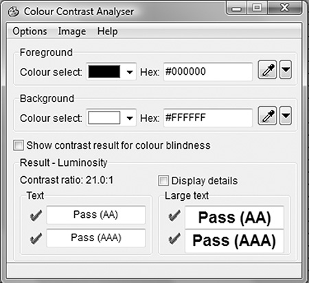
FIGURE 3.2 Paciello Contrast Analyser.
Here are some questions to ask regarding effective information presentation:
Preservation of context
Work to minimize alerts and interruptions as much as possible. “This ensures screen changes and visual interruptions such as pop-ups, instructions, and screen repaints are kept to a minimum during completion of a particular task. Visual interruptions include anything that forces users to shift visual focus away from the area on the screen where they’re currently reading and/or working to address something else and then re-establish focus afterward” (Boone 2010, p. 16). Certainly, there are times when critical information is needed prior to proceeding with a workflow, but be diligent in determining your definition of “critical.”
Alarm fatigue is a phenomenon that has a potentially negative effect on efficiency and patient safety. Dolan (2012, para. 1) stated that “…alerts are designed to inform (users) of possible patient safety issues, but their frequency and often lack of necessity make them the electronic equivalent of the boy who cried wolf.” The intention of an alert is to protect the patient, but too often, we are not careful and consistent about how we design, deploy, and monitor the alerts. Van der Sijs, Aarts, Vulto, and Berg (2006, p. 147) noted that 49% to 96% of drug interaction alerts were overridden for reasons including design and sensitivity. Dolan (2012, para. 2) went on to note that, “[I]t’s clear that the answer is to create systems that take human behavior and supplemental patient data into account when writing rules that decide when and why an alert is fired off. That way, the alerts could have more success in their purpose: protecting patient safety.”
When deciding to interrupt a clinician’s workflow and take them out of context, be mindful of the why behind the what. Is it really important enough to stop the clinician? Is the gain worth the pain? If so, what is the expected interaction with the alert? Make the interruption as minimal as possible and guide the user to the appropriate action. Nielson (1995, para. 9) encouraged that, “[M]essages should be expressed in plain language, precisely indicate the problem, and constructively suggest a solution.” Finally, plan to evaluate the behavior associated with the alert at specified time frames: perhaps 30, 60, and 90 days out from implementation of the alert. Make informed adjustments based on discrete data collection and end-user feedback.
The Agency for Healthcare Research and Quality (AHRQ) (2009) completed a study measuring the percentage of alerts or reminders that resulted in desired action. The overall conclusion indicated that alerts in general—and particularly asynchronous alerts—can “…improve compliance with recommended care and adherence to practice guidelines” (p. 1). Asynchronous alerts occur outside of the standard workflow within the EHR: For example, the order process for a vaccine is complete. However, the system does not allow the discharge paperwork to be completed until documentation occurs on the medication administration record (MAR) regarding the status of the vaccine. Within the same study, the AHRQ offered tools on how to conduct your own study regarding alert effectiveness (
www.ahrq.gov).
Here are some questions to ask regarding preservation of context:
- What are the acceptable circumstances in your organization to stop a clinician’s workflow with an alert?
- How will the effectiveness of the alert, including the usability, be monitored to ensure the desired result is achieved?
Usability testing for your EHR
One of the many challenges that confront the informatics specialist is the development of methods to assess the EHR for the concepts described earlier in this chapter. One method that can assist in the evaluation is user acceptance testing, as described in Chapter 4. As part of any system implementation, upgrade, or enhancement, user acceptance testing should be part of the standard process prior to actual implementation. It is during this testing that system end users are asked to take the system for a test ride.
Figure 3.3 is a simple checklist to consider as you begin your usability journey. Each of these items can certainly be explored in more depth. This is by no means an exhaustive list but a quick tool to give you a sense of where you are good to go and where you may have an opportunity.
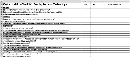 FIGURE 3.3 Click to enlarge.
 Quick Usability Checklist. Courtesy of C. St. John, 2014.
Future directions
One would like to assume that by ensuring a usable, useful, and meaningful EHR, attestation for various regulatory programs, such as Meaningful Use and Value-based Purchasing, would become less burdensome. This may or may not prove to be true in our complex, highly regulated environment and offers an opportunity for further study. Also, in light of EHR certification programs, determining a common set of usability criteria for evaluation and rating would offer weight to the concept. As noted in earlier discussion, by nature of the complex interactions and scenarios inherent in healthcare, as well as the subjectivity of the user, this will prove to be a difficult but not insurmountable task. Continued work by the ONC and HIMSS, partnering with informatics organizations, will yield further research on usability and its role in patient safety. Staggers, Weir, and Phansalkar (2008) noted that “studies in sociotechnical and human-computer interaction are needed. This would help us understand the complex processes inherent in technology design and adoption. Interdisciplinary examinations are needed in future research to understand interdependent roles” (p. 125).
Conclusion
We initiated the chapter with a brief overview and definition. To conclude, we will wrap back to the core of the definition. Usability, in addition to usefulness, equates to a usable EHR and meaningful end-user experience. In your vision and strategy to raise the bar as it relates to usability, employ the concepts discussed and include stakeholders in every step of the journey. The study of usability in our complex, technology-saturated world will continue to evolve. Be innovative in your efforts to ensure that users have a seamless experience with the EHR. Be diligent in considering these concepts and using the tools presented as a springboard to ensuring your systems are usable, useful, and effective in promoting safe patient care. RNL
Chapter author:
Christy St. John, MSN, RN-BC, is associate chief nursing informatics officer for Bon Secours Health System.
Book authors:
Patricia P. Sengstack, DNP, RN-BC, CPHIMS, is chief nursing informatics officer for Bon Secours Health System, and Charles M. Boicey, MS, RN-BC-PMP, CLNC, CPHIMS, is enterprise analytics architect for Stony Brook Medicine.
References
Agency for Healthcare Research and Quality (AHRQ). (2009).
Percentage of alerts or reminders that resulted in desired action. Retrieved from
http://www.ahrq.gov/
Atherton, J. (2011). Development of the electronic health record. American Medical Association Journal of Ethics: Virtual Mentor, 13(3), 186–189.
Belden, J., Grayson, R., & Barnes, J. (2009). Defining and testing EMR usability: Principles and proposed methods of EMR usability evaluation and rating. HIMSS EHR Usability Task Force. Retrieved from http://www.himss.org/files/HIMSSorg/content/files/himss_
definingandtestingemrusability.pdf
Boone, E. (2010). EMR usability: Bridging the gap between nurse and computer. Nursing Management, 41(3), 14–16.
Gibbons, A., & Fairweather, P. (1998). Computer-based instruction: Design and development. Englewood Cliffs, NJ: Educational Technology Publications.
The Joint Commission. (2010). Facts about the official “Do Not Use” list. Retrieved from http://www.jointcommission.org/assets/1/18/Do_Not_Use_List.pdf
Koppel, R., Metlay, J., Cohen, A., Abaluck, B., Localio, A., Kimmel, S., & Strom, B. (2005). Role of computerized physician order entry systems in facilitating medication errors. Journal of the American Medical Association, 293(10), 1197–1203.
Middleton, B., Bloomrosen, M., Dente, M., Hashmat, B., Koppel, R., Overhage, J., … Zhang, J. (2013). Enhancing patient safety and quality of care by improving the usability of electronic health record systems: Recommendations from AMIA. Journal of American Medical Informatics Association, 20(e1), e2–8.
Poissant, L., Pereira, J., Tamblyn, R., & Kawasumi, Y. (2005). The impact of electronic health records on time efficiency of physicians and nurses: A systematic review. Journal of the American Medical Informatics Association, 12(5), 505–516.
Staggers, N., Weir, C., & Phansalkar, S. (2008). Patient safety and health information technology: Role of the electronic health record. In R. G. Hughes (Ed.), Patient safety and quality: An evidence-based handbook for nurses (chapter 47; pp. 3-91–3-133). Rockville, MD: Agency for Healthcare Research and Quality.
van der Sijs H., Aarts J., Vulto A., & Berg, M. (2006). Overriding of drug safety alerts in computerized physician order entry. Journal of the American Medical Informatics Association 13(2), 138–147.
Zhang, J., & Walji, M. (2011). TURF: Toward a unified framework of EHR usability. Journal of Biomedical Informatics, 44(6), 1056–1067. RNL